DOSNOVENTA®JANUARY 2025
THE UNSEEN PATH ™
A LIMITED EDITION OF THE DOSNOVENTA® FULL-CARBON TOKYO FRAME
A responsive grid of article cards with image, title, and excerpt. Accepts any number of articles and a configurable column count. Ready to wire to a CMS — swap the static array for a data fetch.
View Full Demo →A LIMITED EDITION OF THE DOSNOVENTA® FULL-CARBON TOKYO FRAME
IDLE DAYS AROUND YOKOHAMA, CAPTURED THROUGH THE LENS OF LUCAS MONNE.

RIDING THE STREETS OF TOKYO THROUGH THE LENS OF JAKE MORGAN.

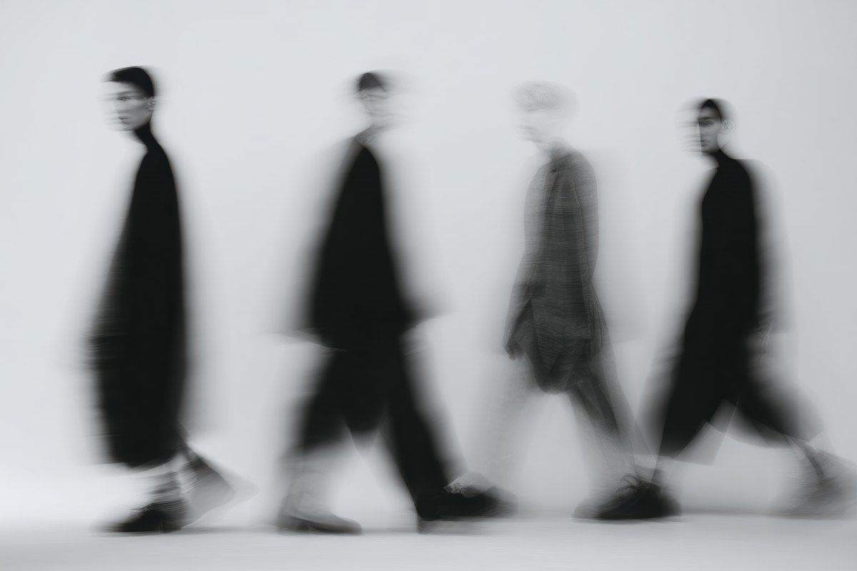
A STORY AROUND A RIDER EMBARKING ON A JOURNEY THROUGH AN UNFAMILIAR URBAN ENVIRONMENT.

RIDING THE STREETS OF TOKYO THROUGH THE LENS OF JORDAN MORGAN.

CURB'S PERSPECTIVE ON THE RIDING DAYS OF KARL KNUDSEN AND MAKING RUNS THROUGH THE CITY.

import ArticleGrid from "./index.jsx";
import { articleGrid } from "../demo-data.js";
import styles from "./demo.module.css";

export default function ArticleGridDemo() {
  return (
    <div className={styles.page}>
      <ArticleGrid articles={articleGrid.articles} columns={2} />
    </div>
  );
}
import Link from "next/link";
import styles from "./styles.module.css";

function ArticleCard({ image, category, title, excerpt, date, url }) {
  return (
    <article className={styles.card}>
      <Link href={url ?? "#"} className={styles.link}>
        <div className={styles.header}>
          <div className={styles.left}>
            <span className={styles.category}>{category}</span>
            <span className={styles.date}>{date}</span>
            <h3 className={styles.title}>{title}</h3>
          </div>
          {excerpt && <p className={styles.excerpt}>{excerpt}</p>}
        </div>
        <div className={styles.imageWrapper}>
          <img
            src={image.src}
            alt={image.alt ?? ""}
            style={{ position: "absolute", inset: 0, width: "100%", height: "100%", objectFit: "cover", objectPosition: "center" }}
          />
        </div>
      </Link>
    </article>
  );
}

export default function ArticleGrid({ articles = [], columns = 2 }) {
  return (
    <section className={styles.section}>
      <div className={styles.grid} style={{ "--columns": columns }}>
        {articles.map((article) => (
          <ArticleCard key={article.slug} {...article} />
        ))}
      </div>
    </section>
  );
}
.page {
  background: #fff;
  color: #111;
  padding: 0 4vw;
}
.section {
  --color-black: #111;
  --color-border: rgba(0, 0, 0, 0.12);
  --font-title: 1.375rem;
  --font-meta: 0.7rem;
  --weight-bold: 700;
}

/* ---- Grid ---- */
.grid {
  display: grid;
  grid-template-columns: repeat(var(--columns, 2), 1fr);
}

.card {
  border-top: 1px solid var(--color-border);
  padding: 1.5rem 2rem 0;
}

/* Vertical column divider */
.card:nth-child(odd) {
  padding-left: 0;
  border-right: 1px solid var(--color-border);
}
.card:nth-child(even) {
  padding-right: 0;
}

/* ---- Card link ---- */
.link {
  display: flex;
  flex-direction: column;
  color: var(--color-black);
  text-decoration: none;
}

/* ---- Header: text above image on desktop ---- */
.header {
  display: grid;
  grid-template-columns: 1fr 1fr;
  gap: 1.5rem;
  padding-bottom: 1.5rem;
  order: 1;
}

/* Left block: category → title → date stacked */
.left {
  display: grid;
  grid-template-areas:
    "category"
    "title"
    "date";
  align-content: start;
}

.category {
  grid-area: category;
  font-size: var(--font-title);
  font-weight: var(--weight-bold);
  text-transform: uppercase;
  letter-spacing: 0.02em;
  line-height: 1.2;
}

.title {
  grid-area: title;
  font-size: var(--font-title);
  font-weight: var(--weight-bold);
  text-transform: uppercase;
  letter-spacing: 0.02em;
  line-height: 1.2;
  margin: 0;
}

.date {
  grid-area: date;
  font-size: var(--font-meta);
  text-transform: uppercase;
  letter-spacing: 0.08em;
  color: var(--color-black);
  margin-top: 0.6em;
}

/* Right block: excerpt */
.excerpt {
  font-size: var(--font-meta);
  text-transform: uppercase;
  letter-spacing: 0.04em;
  line-height: 1.55;
  color: var(--color-black);
  align-self: start;
  padding-top: 0.2em;
  margin: 0;
}

/* ---- Image: below header on desktop ---- */
.imageWrapper {
  order: 2;
  width: 100%;
  aspect-ratio: 8 / 5;
  position: relative;
  overflow: hidden;
}

/* ---- Mobile ---- */
@media (max-width: 768px) {
  .grid {
    grid-template-columns: 1fr;
  }

  /* Remove column dividers */
  .card:nth-child(odd),
  .card:nth-child(even) {
    padding-left: 0;
    padding-right: 0;
    border-right: none;
  }

  /* Image above text on mobile */
  .imageWrapper { order: 1; }
  .header {
    grid-template-columns: 1fr;
    order: 2;
    padding-top: 1rem;
    padding-bottom: 1rem;
  }

  /* Category + date on the same row, title below */
  .left {
    grid-template-areas:
      "category date"
      "title    title";
    grid-template-columns: 1fr auto;
    gap: 0 1rem;
  }

  .date { margin-top: 0; align-self: center; }
}
Apr 11, 2026
CARDSFull-bleed product card with background image, overlay logo/price, and a CTA button. Switches from overlay mode (tablet/mobile) to a right-panel info layout (wide desktop). Ready to wire to Shopify Storefront API.
Apr 11, 2026
CARDS3-column product grid with square image cards and a bottom info strip showing title and price. Collapses to 2 columns on mobile. Ready to wire to Shopify Storefront API or any product collection endpoint.
Apr 7, 2025
CARDSA semi-transparent dark overlay with backdrop blur appears over a card on hover. Frames the card content and creates depth by softening the background image. Source: itsjay.us work cards.


