ShopifyIntermediateApril 10, 2026
Product Detail Page
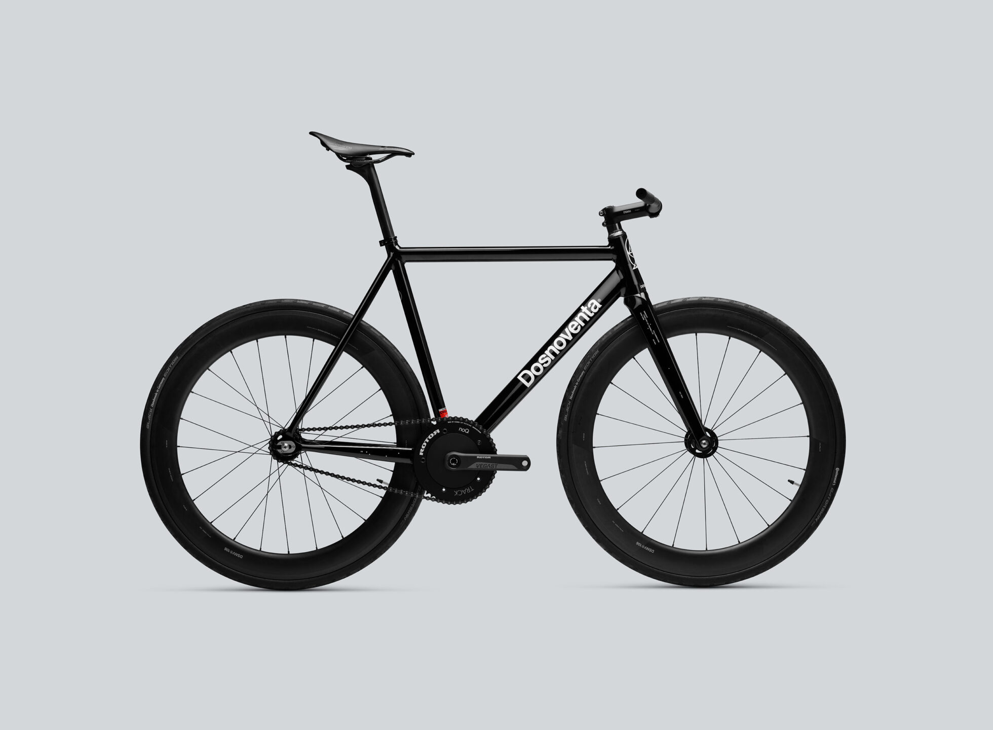
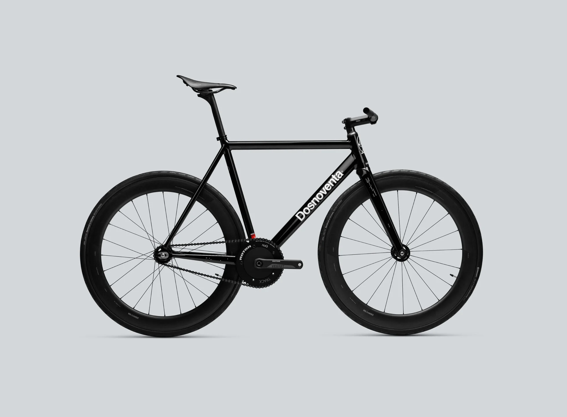
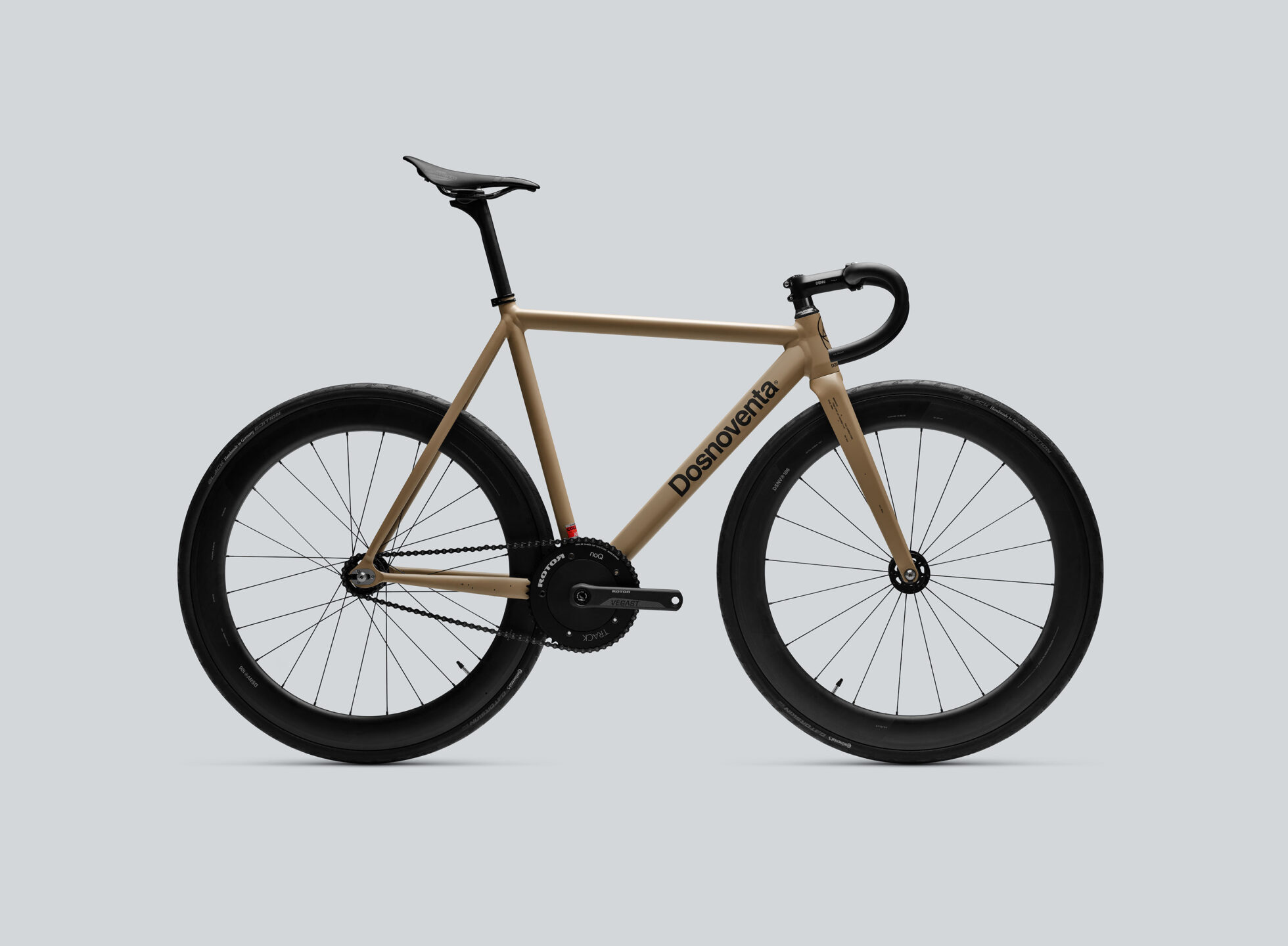
A Shopify-style product detail page with a sticky sidebar, variation selectors (size, handlebar), gallery, and a specs table. Two-column layout: scrollable left content column, fixed-width sticky right sidebar.
View Full Demo →Preview
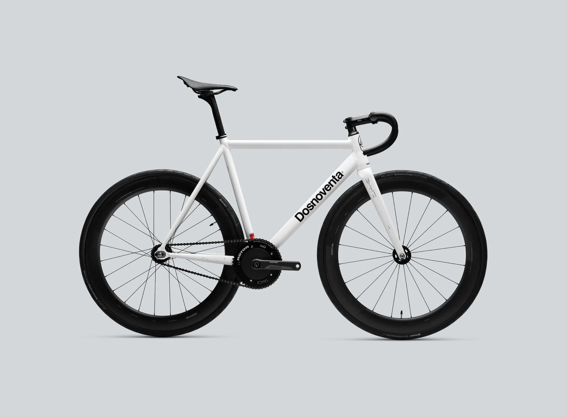
DESIGNED TO BE A MULTIPURPOSE BIKE, WITH A SHAPE SUITABLE FOR ALL KINDS OF USES, FROM YOUR DAILY COMMUTE TO THE CITY TO MEETING ALL THE MOST DEMANDING RIDER'S NEEDS REGARDING COMPETITIONS AND TRAINING. LIGHTWEIGHT, STIFF, HIGH CLASS AND COMFORT. THE LOS ANGELES IS NOVATREX'S TOP-SELLER.
| FRAME | NOVATREX LOS ANGELES . COLUMBUS AIRPLANE ALU TUBING |
| FORK | FULL CARBON FORK . TAPERED 1-1/8" . RAKE 45MM . 700X32C MAX |
| FRAME SET COLOR | JET BLACK GLOSS |
| HEADSET | COLUMBUS COMPASS . 1-1/8" CARBON |
| WHEEL SET | NTVX®106 CARBON WHEEL SET . 60MM DEPTH . CLINCHER |
| CRANKS | ROTOR VEGAST . 165MM |
| CHAINRING | ROTOR 49T |
| BB | ROTOR TRACK 30 BSA |
| HANDLEBAR (OPTION 01) | NTVX®101 CARBON DROP BAR . 400MM |
| HANDLEBAR (OPTION 02) | NTVX®102 CARBON FLAT BAR |
| STEM | NTVX®103 ALU STEM . 100MM |
| SEATPOST | NTVX®105 CARBON SEATPOST . Ø 27,2MM |
| SADDLE | SELLE SAN MARCO . SHORTFIT DYNAMIC NARROW |
| SEAT CLAMP | COLUMBUS ALU SEAT CLAMP |
| GRIP | STRONG V TRACK GRIPS BLACK (INCLUDED ONLY WITH FLAT BAR) |
| COG | NTVX CUSTOM STEEL COG . 18T |
| TIRES | CONTINENTAL ULTRA SPORT III . 700X25 C . FOLDABLE . BLACK |
| PEDALS | NOT INCLUDED |
| BIKE WEIGHT | 6410 GR (M SIZE - WITHOUT PEDALS) |
Source
demo.jsx
import ProductDetailPage from "./index.jsx";
import { productDetailPage } from "../demo-data.js";

export default function ProductDetailPageDemo() {
  return <ProductDetailPage product={productDetailPage} />;
}
index.jsx
"use client";

import { useState } from "react";
import styles from "./styles.module.css";

function Breadcrumbs({ items }) {
  return (
    <nav className={styles.breadcrumbs} aria-label="Breadcrumb">
      {items.map((item, i) => (
        <span key={i} className={styles.breadcrumbItem}>
          {i > 0 && <span className={styles.breadcrumbSep} aria-hidden="true">/</span>}
          {item.link ? (
            <a href={item.link} className={styles.breadcrumbLink}>{item.label}</a>
          ) : (
            <span>{item.label}</span>
          )}
        </span>
      ))}
    </nav>
  );
}

function Gallery({ images, description }) {
  return (
    <div className={styles.gallery}>
      <figure className={`${styles.productImage} ${styles.productImageHero}`}>
        <img src={images[0]} alt="" />
      </figure>

      <h3 className={styles.productDescription}>{description}</h3>

      {images.slice(1).map((src, i) => (
        <figure className={styles.productImage} key={i}>
          <img src={src} alt="" />
        </figure>
      ))}
    </div>
  );
}

function Specs({ specs }) {
  return (
    <div className={styles.specsWrapper}>
      <table className={styles.specsTable}>
        <tbody>
          {specs.map((item, i) => (
            <tr key={i} className={styles.specsRow}>
              <td className={styles.specsLabel}>{item.label}</td>
              <td className={styles.specsValue}>{item.value}</td>
            </tr>
          ))}
        </tbody>
      </table>
    </div>
  );
}

function VariationGroup({ label, options, selected, onSelect }) {
  return (
    <div className={styles.variationGroup}>
      <small className={styles.variationLabel}>{label}</small>
      <div className={styles.variationOptions}>
        {options.map((opt, i) => (
          <button
            key={i}
            className={`${styles.variationBtn} ${selected === opt ? styles.variationBtnSelected : ""}`}
            onClick={() => onSelect(opt)}
          >
            {opt}
          </button>
        ))}
      </div>
    </div>
  );
}

function Sidebar({ product }) {
  const [selectedSize, setSelectedSize] = useState(null);
  const [selectedHandlebar, setSelectedHandlebar] = useState(null);

  return (
    <aside className={styles.sidebar}>
      {product.logoText && (
        <p className={styles.logoText}>{product.logoText}</p>
      )}

      <h1 className={styles.productTitle}>{product.title}</h1>

      {product.subtitle && (
        <p className={styles.productSubtitle}>{product.subtitle}</p>
      )}

      <p className={styles.productPrice}>
        ${product.price} / {product.availability}
      </p>

      <div className={styles.variations}>
        {product.sizes?.length > 0 && (
          <VariationGroup
            label="Select Size"
            options={product.sizes}
            selected={selectedSize}
            onSelect={setSelectedSize}
          />
        )}

        {product.handlebars?.length > 0 && (
          <VariationGroup
            label="Select Handlebar"
            options={product.handlebars}
            selected={selectedHandlebar}
            onSelect={setSelectedHandlebar}
          />
        )}

        <button className={styles.addToCart}>ADD TO CART</button>
      </div>
    </aside>
  );
}

export default function ProductDetailPage({ product }) {
  return (
    <main className={styles.page}>
      <div className={styles.container}>
        <Breadcrumbs items={product.breadcrumbs} />

        <div className={styles.layout}>
          <div className={styles.content}>
            <Gallery images={product.images} description={product.description} />
            <Specs specs={product.specs} />
          </div>

          <Sidebar product={product} />
        </div>
      </div>
    </main>
  );
}
styles.module.css
.page {
  background: #fff;
  color: #000;
  min-height: 100vh;
  width: 88%;
}

.container {
  padding: 2rem 3.5rem 4rem;
}

/* ─── Breadcrumbs ─── */

.breadcrumbs {
  display: flex;
  align-items: center;
  flex-wrap: wrap;
  gap: 0.375rem;
  font-size: 0.688rem;
  text-transform: uppercase;
  letter-spacing: 0.08em;
  margin-bottom: 1.5rem;
}

.breadcrumbItem {
  display: flex;
  align-items: center;
  gap: 0.375rem;
}

.breadcrumbSep {
  color: #000;
}

.breadcrumbLink:hover {
  text-decoration: underline;
}

/* ─── Two-column layout ─── */

.layout {
  display: flex;
  align-items: flex-start;
  gap: 4.5rem;
}

.content {
  flex: 1;
  min-width: 0;
}

.sidebar {
  width: 380px;
  flex-shrink: 0;
  position: sticky;
  top: 44px; /* offset for DemoNav */
  align-self: flex-start;
}

/* ─── Gallery ─── */

.productImage {
  margin: 0;
}

.gallery {
  display: flex;
  flex-direction: column;
  gap: 0.5rem;
}

.productImage img {
  width: 100%;
  height: auto;
  display: block;
}

.productImageHero {
  height: 65vh;
}

.productImageHero img {
  width: 100%;
  height: 100%;
  object-fit: cover;
}

.productDescription {
  font-size: clamp(1.25rem, 2.1vw, 1.875rem);
  font-weight: 700;
  text-transform: uppercase;
  line-height: 1.25;
  letter-spacing: -0.01em;
  margin: .25rem 0;
}

/* ─── Specs ─── */

.specsWrapper {
  margin-bottom: 4rem;
}

.specsTable {
  width: 100%;
  border-collapse: collapse;
  font-size: 0.8rem;
  font-weight: 600;
  text-transform: uppercase;
  letter-spacing: 0.04em;
}

.specsRow {
  border-bottom: 1px solid #000;
}

.specsRow:first-child {
  border-top: 1px solid #000;
}

.specsLabel {
  padding: 0.5rem 1rem 0.5rem 0;
  font-weight: 700;
  width: 28%;
  vertical-align: top;
  white-space: nowrap;
}

.specsValue {
  padding: 0.5rem 0;
  vertical-align: top;
}

/* ─── Sidebar ─── */

.logoText {
  font-family: cursive;
  font-size: 3.25rem;
  font-weight: normal;
  line-height: 1.05;
  margin-bottom: 1rem;
}

.productTitle {
  font-size: 1.75rem;
  font-weight: 700;
  text-transform: uppercase;
  line-height: 1.2;
  letter-spacing: -0.03em;
  margin-bottom: 0.75rem;
}

.productSubtitle {
  font-size: 0.8rem;
  text-transform: uppercase;
  letter-spacing: 0.01em;
  line-height: 1.55;
  margin-bottom: 1rem;
}

.productPrice {
  font-size: 1.75rem;
  font-weight: 700;
  margin-bottom: 1.5rem;
  letter-spacing: -0.03em;

}

.variations {
  display: flex;
  flex-direction: column;
  gap: 1.125rem;

}

/* ─── Variation group ─── */

.variationGroup {
  display: flex;
  flex-direction: column;
  gap: 0.5rem;  letter-spacing: -0.03em;

}

.variationLabel {
  font-size: 0.688rem;
  text-transform: uppercase;
  letter-spacing: -0.03em;
  font-style: normal;
}

.variationOptions {
  display: flex;
  gap: 0.5rem;
  flex-wrap: wrap;
}

.variationBtn {
  border: 1px solid #000;
  border-radius: 9999px;
  padding: 0.5rem 1.25rem;
  font-size: 0.75rem;
  text-transform: uppercase;
  letter-spacing: -0.03em;
  font-weight: 700;
  cursor: pointer;
  background: transparent;
  color: #000;
  transition: background 0.15s, color 0.15s;
}

.variationBtn:hover {
  background: #f0f0f0;
}

.variationBtnSelected {
  background: #000;
  color: #fff;
}

.variationBtnSelected:hover {
  background: #000;
}

/* ─── Add to cart ─── */

.addToCart {
  width: 100%;
  border: 1px solid #000;
  border-radius: 9999px;
  padding: 0.625rem 1rem;
  font-size: 0.75rem;
  text-transform: uppercase;
  letter-spacing: -.03em;
  font-weight: 700;
  cursor: pointer;
  background: transparent;
  color: #000;
  transition: background 0.15s, color 0.15s;
}

.addToCart:hover {
  background: #000;
  color: #fff;
}

/* ─── Responsive ─── */

@media (max-width: 768px) {
  .container {
    padding: 1.5rem 1.25rem 3rem;
  }

  .layout {
    flex-direction: column;
  }

  .sidebar {
    width: 100%;
    position: static;
    order: -1;
    margin-bottom: 2rem;
  }
}