Double Gallery
Pairs of images that redistribute their widths as you move the mouse across the screen. The dominant image shrinks as the secondary expands, using lerp-smoothed requestAnimationFrame. Pairs alternate between 66/33 and 33/66 splits.
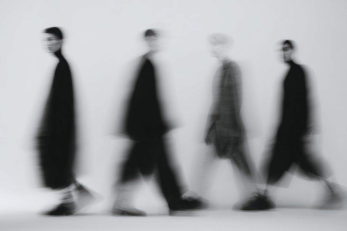
View Full Demo →Preview
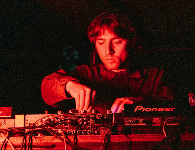
Kickandbass
Motion-forward Shopify storefront for a London music label.
2024
Westend
Campaign site for a community arts organisation.
2024
Delivrd
Brand identity and web for a logistics startup.
2023
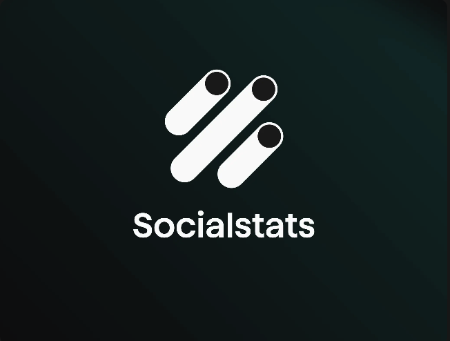
Socialstats
Data product for social media managers.
2023

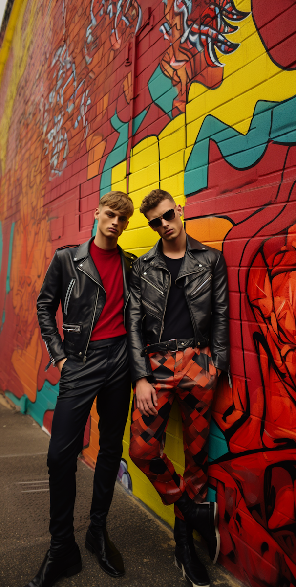
Kevin Davis
Artist portfolio for a London-based photographer.
2023
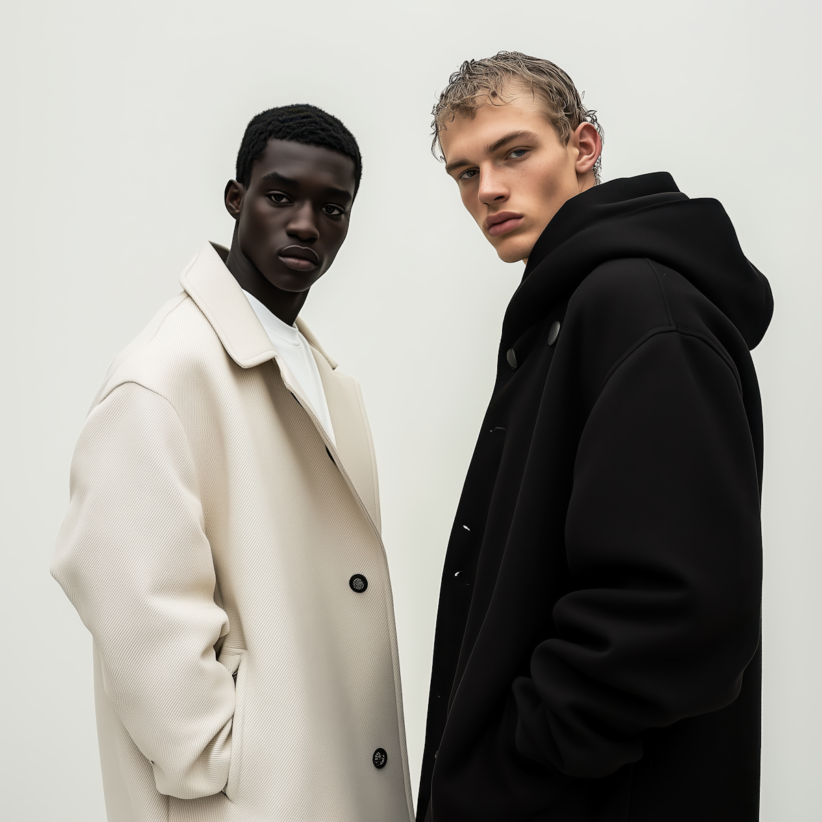
No-5 Studio
Studio identity and digital presence.
2024
Source
import DoubleGallery from "./index.jsx";
import { doubleGallery } from "@/content/media/demo-data.js";
import styles from "./demo.module.css";

export default function DoubleGalleryDemo() {
  return (
    <div className={styles.demo}>
      <h2 className={styles.heading}>Selected Work</h2>
      <DoubleGallery projects={doubleGallery.projects} />
    </div>
  );
}
"use client";

import { useRef, useEffect } from "react";
import styles from "./styles.module.css";

function Double({ projects, reversed }) {
  const firstImageRef = useRef(null);
  const secondImageRef = useRef(null);

  const rafId = useRef(null);
  const xPercent = useRef(reversed ? 100 : 0);
  const currentXPercent = useRef(reversed ? 100 : 0);
  const speed = 0.15;

  const animate = () => {
    const delta = xPercent.current - currentXPercent.current;
    currentXPercent.current = currentXPercent.current + delta * speed;

    const firstPercent = 66.66 - currentXPercent.current * 0.33;
    const secondPercent = 33.33 + currentXPercent.current * 0.33;

    if (firstImageRef.current)
      firstImageRef.current.style.width = `${firstPercent}%`;
    if (secondImageRef.current)
      secondImageRef.current.style.width = `${secondPercent}%`;

    if (Math.round(xPercent.current) === Math.round(currentXPercent.current)) {
      cancelAnimationFrame(rafId.current);
      rafId.current = null;
    } else {
      rafId.current = requestAnimationFrame(animate);
    }
  };

  const handleMouseMove = (e) => {
    xPercent.current = (e.clientX / window.innerWidth) * 100;
    if (!rafId.current) {
      rafId.current = requestAnimationFrame(animate);
    }
  };

  useEffect(() => {
    return () => {
      if (rafId.current) cancelAnimationFrame(rafId.current);
    };
  }, []);

  return (
    <div className={styles.double} onMouseMove={handleMouseMove}>

      {/* First image */}
      <div
        ref={firstImageRef}
        className={`${styles.imageContainer} ${styles.first}`}
      >
        <div className={styles.stretchyWrapper}>
          <img
            src={projects[0].src}
            alt={projects[0].alt || projects[0].name}
            className={styles.image}
          />
        </div>
        <div className={styles.body}>
          <h3 className={styles.name}>{projects[0].name}</h3>
          <p className={styles.description}>{projects[0].description}</p>
          <p className={styles.year}>{projects[0].year}</p>
        </div>
      </div>

      {/* Second image */}
      <div
        ref={secondImageRef}
        className={`${styles.imageContainer} ${styles.second}`}
      >
        <div className={styles.stretchyWrapper}>
          <img
            src={projects[1].src}
            alt={projects[1].alt || projects[1].name}
            className={styles.image}
          />
        </div>
        <div className={styles.body}>
          <h3 className={styles.name}>{projects[1].name}</h3>
          <p className={styles.description}>{projects[1].description}</p>
          <p className={styles.year}>{projects[1].year}</p>
        </div>
      </div>

    </div>
  );
}

export default function DoubleGallery({ projects = [], className = "" }) {
  const pairs = [];
  for (let i = 0; i < projects.length - 1; i += 2) {
    pairs.push([projects[i], projects[i + 1]]);
  }

  return (
    <div className={`${styles.gallery} ${className}`}>
      {pairs.map((pair, index) => (
        <Double
          key={index}
          projects={pair}
          reversed={index % 2 !== 0}
        />
      ))}
    </div>
  );
}
.demo {
  background: #f5f4f0;
  padding: 5rem 0 8rem;
}

.heading {
  font-size: clamp(1.5rem, 3vw, 2.5rem);
  font-weight: 500;
  letter-spacing: -0.02em;
  margin: 0 0 0;
  padding: 0 1.5rem;
  color: #111;
}
/* Local tokens */
.gallery {
  --space-xs: 0.5rem;
  --space-xs-plus: 0.625rem;
  --font-h6: 0.75rem;
  --font-body: 0.875rem;
  --weight-normal: 400;
  --color-gray-light: rgba(0, 0, 0, 0.4);
  --color-gray: rgba(0, 0, 0, 0.6);

  width: 100%;
  display: flex;
  flex-direction: column;
}

/* Double row */
.double {
  display: flex;
  margin-top: 10vh;
  height: 45vw;
}

.imageContainer {
  overflow: hidden;
  flex-shrink: 0;
}

/* Default widths */
.first {
  width: 66.66%;
}

.second {
  width: 33.33%;
}

/* Reversed pair */
.double:nth-child(even) .first {
  width: 33.33%;
}

.double:nth-child(even) .second {
  width: 66.66%;
}

/* Stretchy wrapper — padding trick for 3:2 aspect ratio */
.stretchyWrapper {
  position: relative;
  padding-bottom: 66%;
  overflow: hidden;
}

.image {
  position: absolute;
  inset: 0;
  width: 100%;
  height: 100%;
  object-fit: cover;
  display: block;
}

/* Body */
.body {
  padding: var(--space-xs-plus);
}

.name {
  font-size: var(--font-h6);
  font-weight: var(--weight-normal);
  margin: 0 0 var(--space-xs) 0;
  line-height: 1.2;
}

.description {
  font-size: var(--font-body);
  margin: 0;
  color: var(--color-gray-light);
}

.year {
  font-size: var(--font-body);
  margin: 0;
  color: var(--color-gray);
}
More in Media

Apr 9, 2026
MEDIAMasonry Grid
CSS-variable-driven masonry layout calculated in JavaScript. Columns and gaps are controlled via custom properties, items are absolutely positioned into the shortest column, and the grid reflows on resize. Supports four aspect-ratio variants per item: default (3/4), square, wide, and tall.