MediaIntermediateApril 9, 2026
Masonry Grid
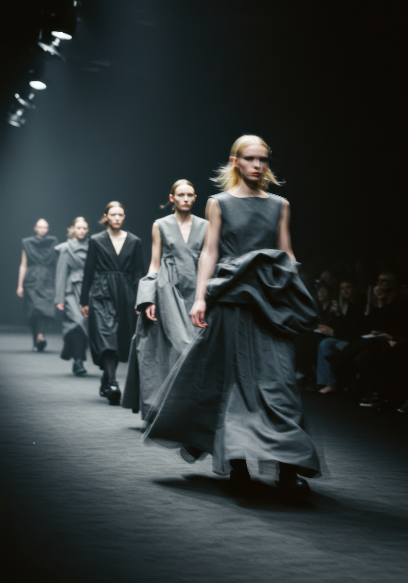
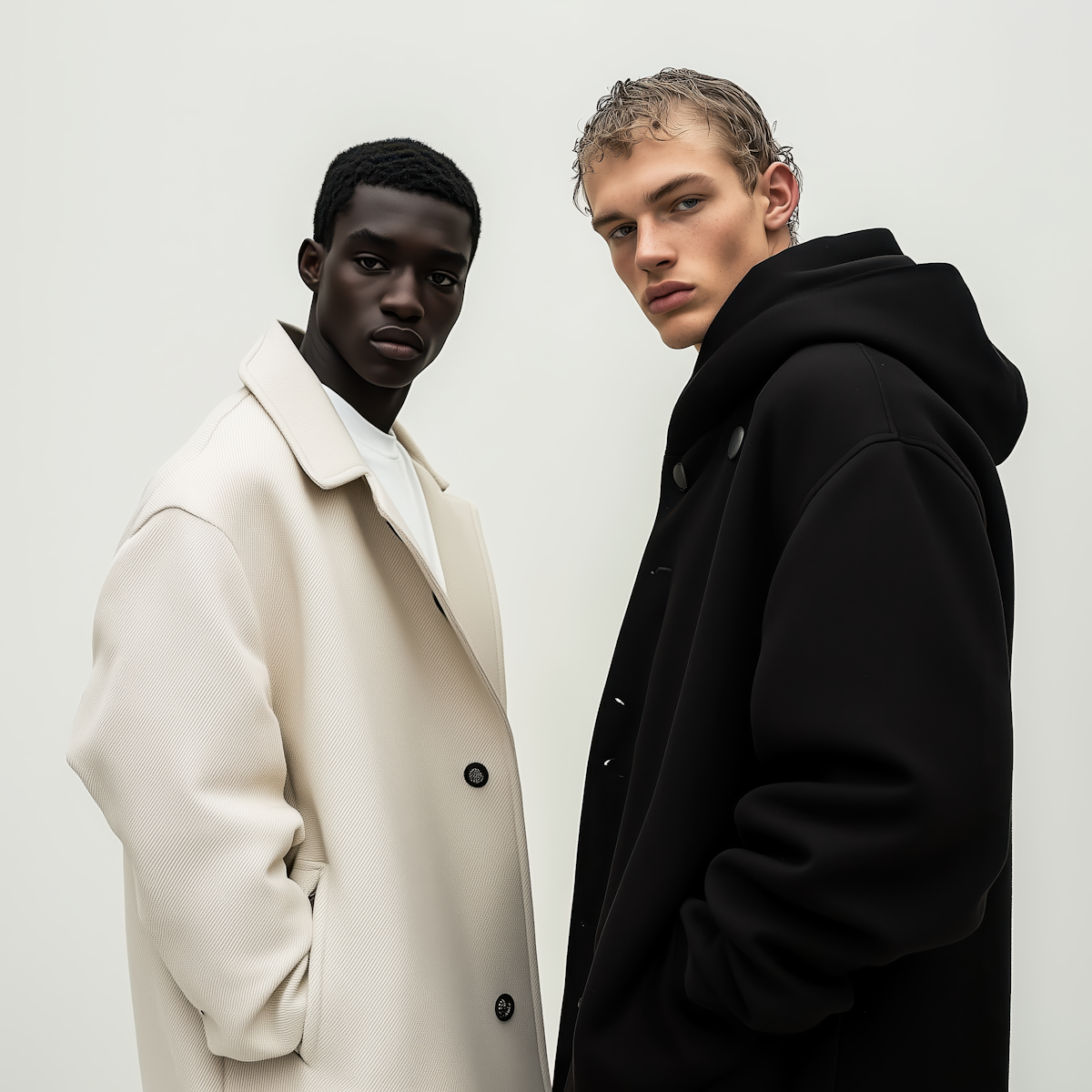
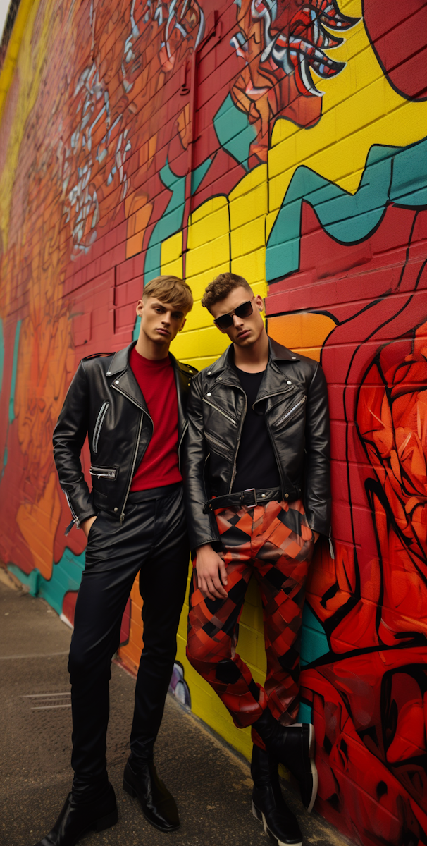
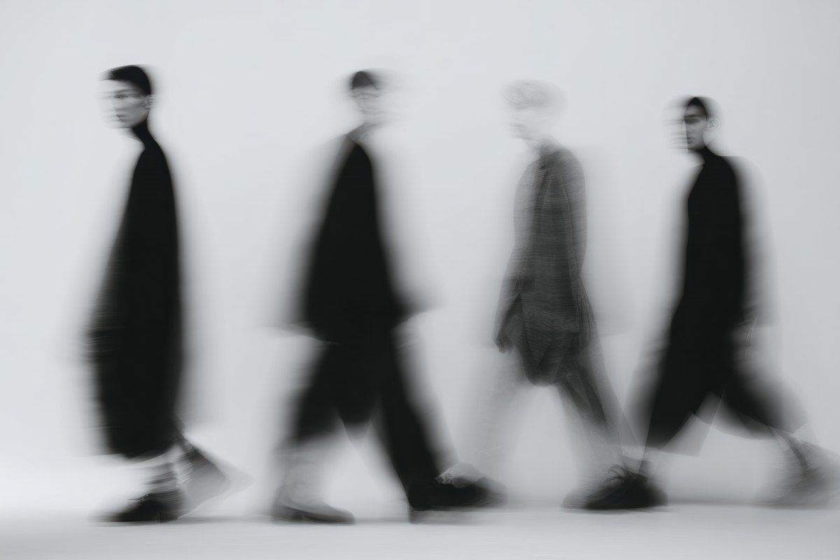
CSS-variable-driven masonry layout calculated in JavaScript. Columns and gaps are controlled via custom properties, items are absolutely positioned into the shortest column, and the grid reflows on resize. Supports four aspect-ratio variants per item: default (3/4), square, wide, and tall.
View Full Demo →Preview
Explore our gallery

Source
demo.jsx
import MasonryGrid from './index.jsx';
const ITEMS = [
// — batch 1 —
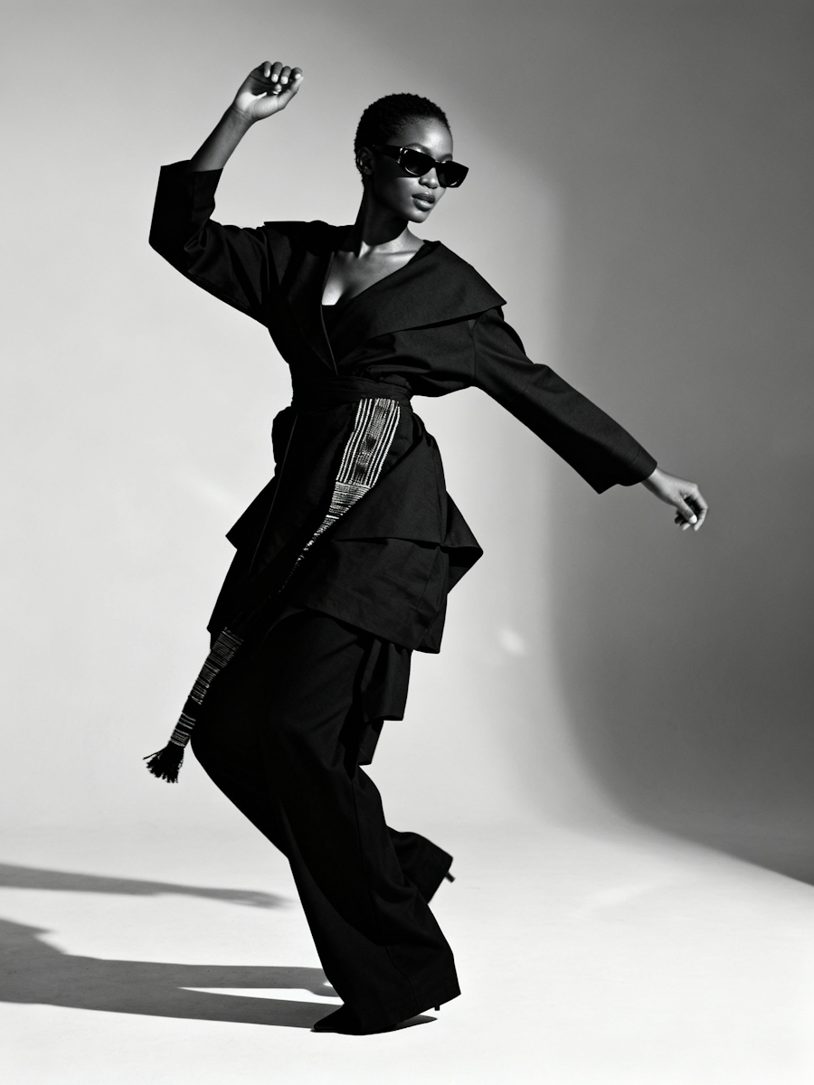
{ src: '/demo-assets/models/model0.png', alt: '', variant: 'tall' },
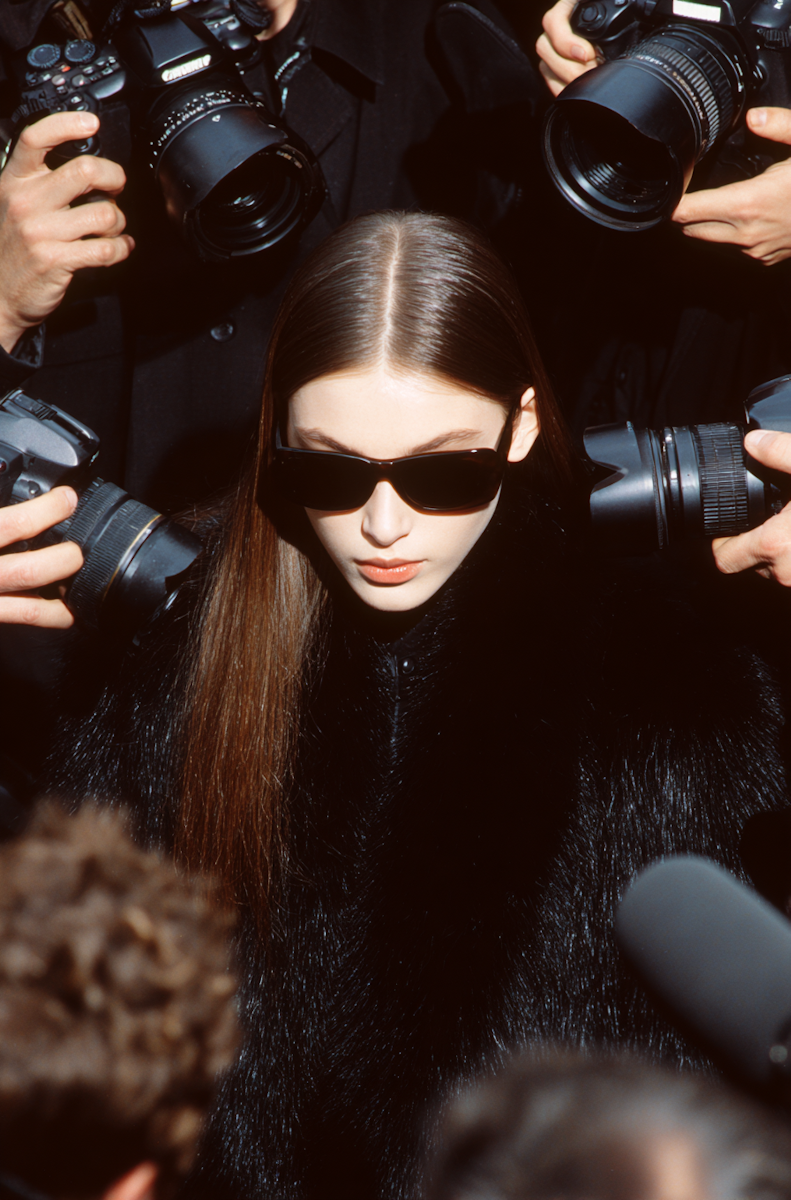
{ src: '/demo-assets/models/model1.png', alt: '' },
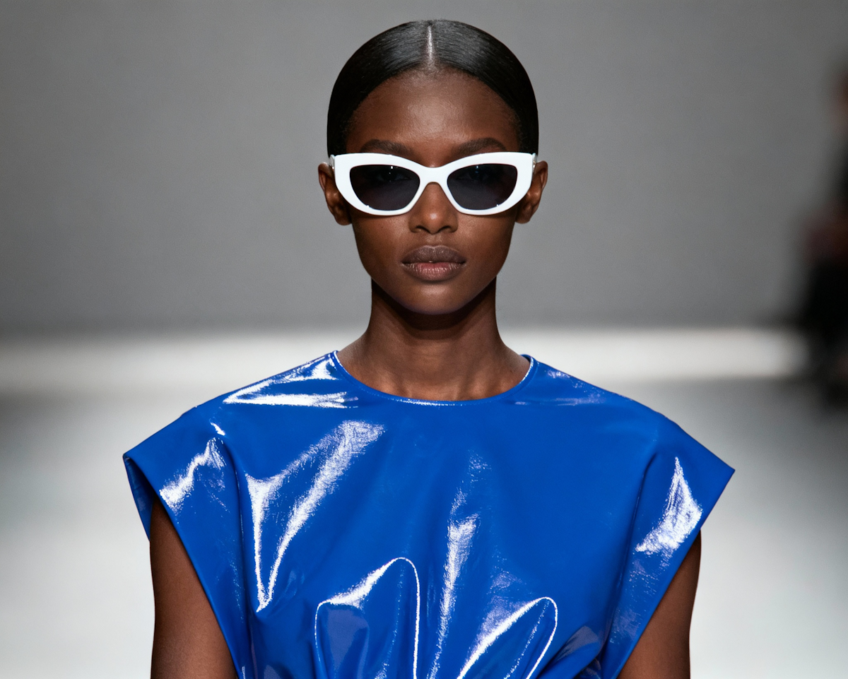
{ src: '/demo-assets/models/model2.png', alt: '', variant: 'square' },
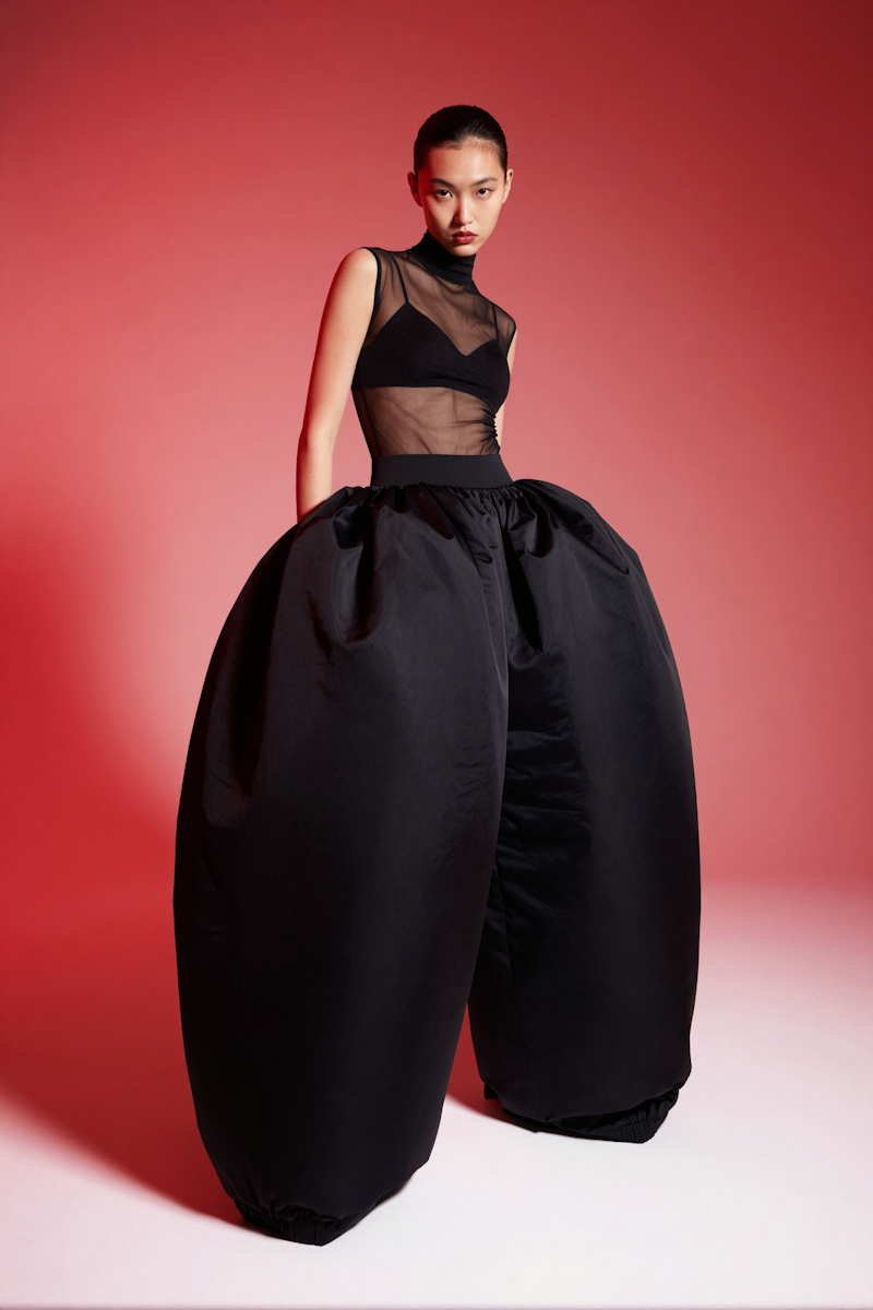
{ src: '/demo-assets/models/model3.png', alt: '', variant: 'wide' },
{ src: '/demo-assets/models/model4.png', alt: '' },
{ src: '/demo-assets/models/model5.png', alt: '', variant: 'tall' },
{ src: '/demo-assets/models/model6.png', alt: '', variant: 'square' },
{ src: '/demo-assets/models/model7.png', alt: '' },
{ src: '/demo-assets/models/model8.png', alt: '', variant: 'wide' },
// — batch 2 (different order + variants) —
{ src: '/demo-assets/models/model5.png', alt: '', variant: 'wide' },
{ src: '/demo-assets/models/model2.png', alt: '', variant: 'tall' },
{ src: '/demo-assets/models/model8.png', alt: '' },
{ src: '/demo-assets/models/model0.png', alt: '', variant: 'square' },
{ src: '/demo-assets/models/model7.png', alt: '', variant: 'wide' },
{ src: '/demo-assets/models/model3.png', alt: '' },
{ src: '/demo-assets/models/model1.png', alt: '', variant: 'tall' },
{ src: '/demo-assets/models/model6.png', alt: '', variant: 'wide' },
{ src: '/demo-assets/models/model4.png', alt: '', variant: 'square' },
// — batch 3 (different order + variants) —
{ src: '/demo-assets/models/model4.png', alt: '', variant: 'tall' },
{ src: '/demo-assets/models/model8.png', alt: '', variant: 'square' },
{ src: '/demo-assets/models/model6.png', alt: '' },
{ src: '/demo-assets/models/model1.png', alt: '', variant: 'wide' },
{ src: '/demo-assets/models/model3.png', alt: '', variant: 'tall' },
{ src: '/demo-assets/models/model0.png', alt: '' },
{ src: '/demo-assets/models/model7.png', alt: '', variant: 'square' },
{ src: '/demo-assets/models/model2.png', alt: '' },
{ src: '/demo-assets/models/model5.png', alt: '', variant: 'tall' },
];
export default function MasonryGridDemo() {
return <MasonryGrid title="Explore our gallery" items={ITEMS} />;
}
index.jsx
'use client';
import { useEffect, useRef } from 'react';
import styles from './styles.module.css';

export default function MasonryGrid({ title = 'Explore our gallery', items = [] }) {
  const listRef = useRef(null);
  const itemRefsArray = useRef([]);

  useEffect(() => {
    const container = listRef.current;
    if (!container || items.length === 0) return;

    function readGap() {
      const raw = getComputedStyle(container).getPropertyValue('--masonry-gap').trim();
      if (!raw) return 0;
      const temp = document.createElement('div');
      temp.style.width = raw;
      temp.style.position = 'absolute';
      temp.style.visibility = 'hidden';
      container.appendChild(temp);
      const px = temp.offsetWidth;
      container.removeChild(temp);
      return px;
    }

    function layout() {
      const cs = getComputedStyle(container);
      const cols = parseInt(cs.getPropertyValue('--masonry-col'));
      const gapPx = readGap();
      const wCalc = `(100% - ${cols - 1} * var(--masonry-gap)) / ${cols}`;
      const colHeights = Array(cols).fill(0);
      const itemEls = itemRefsArray.current.filter(Boolean);

      container.style.position = 'relative';

      itemEls.forEach(el => {
        el.style.position = 'absolute';
        el.style.width = `calc(${wCalc})`;
      });

      itemEls.forEach(el => {
        const h = el.offsetHeight;
        const idx = colHeights.indexOf(Math.min(...colHeights));
        el.style.top = `${colHeights[idx]}px`;
        el.style.left = `calc((${wCalc}) * ${idx} + var(--masonry-gap) * ${idx})`;
        colHeights[idx] += h + gapPx;
      });

      container.style.height = `${Math.max(...colHeights)}px`;
    }

    function watchImages() {
      container.querySelectorAll('img').forEach(img => {
        if (!img.complete) {
          img.addEventListener('load', layout, { once: true });
          img.addEventListener('error', layout, { once: true });
        }
      });
    }

    let resizeTimer;
    function handleResize() {
      clearTimeout(resizeTimer);
      resizeTimer = setTimeout(layout, 100);
    }

    layout();
    watchImages();
    window.addEventListener('resize', handleResize);

    return () => {
      window.removeEventListener('resize', handleResize);
      clearTimeout(resizeTimer);
    };
  }, [items]);

  return (
    <section className={styles.section}>
      {title && <h2 className={styles.heading}>{title}</h2>}
      <div className={styles.wrap}>
        <div ref={listRef} className={styles.list}>
          {items.map((item, i) => (
            <div
              key={i}
              ref={el => (itemRefsArray.current[i] = el)}
              className={styles.item}
            >
              <div className={`${styles.visual} ${item.variant ? styles[item.variant] : ''}`}>
                <img
                  src={item.src}
                  alt={item.alt}
                  className={styles.img}
                />
              </div>
            </div>
          ))}
        </div>
      </div>
    </section>
  );
}
styles.module.css
/* Local token definitions — component is self-contained */
.section {
  --color-black: #0a0a0a;
  --color-white: #ffffff;
  --space-m: 1rem;
  --space-xs: 0.5rem;
  --space-2xl: 2.5rem;
  --space-7xl: 5rem;
  --space-11xl: 8rem;
  --font-h1: clamp(2.5rem, 6vw, 5rem);

  background-color: var(--color-black);
  padding-block-start: var(--space-11xl);
}

.heading {
  text-align: center;
  color: var(--color-white);
  font-size: var(--font-h1);
  font-weight: var(--weight-normal);
  line-height: 1.1;
  padding-inline: var(--space-2xl);
  padding-block-end: var(--space-11xl);
}

.wrap {
  padding-inline: var(--space-2xl);
  padding-block-end: var(--space-7xl);
}

.list {
  --masonry-col: 4;
  --masonry-gap: var(--space-m);
  display: flex;
  flex-wrap: wrap;
  justify-content: flex-start;
  align-items: flex-start;
  position: relative;
}

.visual {
  border-radius: 1.25rem;
  width: 100%;
  overflow: hidden;
  position: relative;
  aspect-ratio: 3 / 4;
}

.square {
  aspect-ratio: 1;
}

.wide {
  aspect-ratio: 3 / 2;
}

.tall {
  aspect-ratio: 2 / 3;
}

.img {
  position: absolute;
  inset: 0;
  width: 100%;
  height: 100%;
  object-fit: cover;
}

@media (max-width: 991px) {
  .list {
    --masonry-col: 3;
  }
}

@media (max-width: 767px) {
  .list {
    --masonry-col: 2;
    --masonry-gap: var(--space-xs);
  }

  .wrap {
    padding-inline: var(--space-xs);
  }
}
More in Media

Apr 9, 2026
MEDIADouble Gallery
Pairs of images that redistribute their widths as you move the mouse across the screen. The dominant image shrinks as the secondary expands, using lerp-smoothed requestAnimationFrame. Pairs alternate between 66/33 and 33/66 splits.