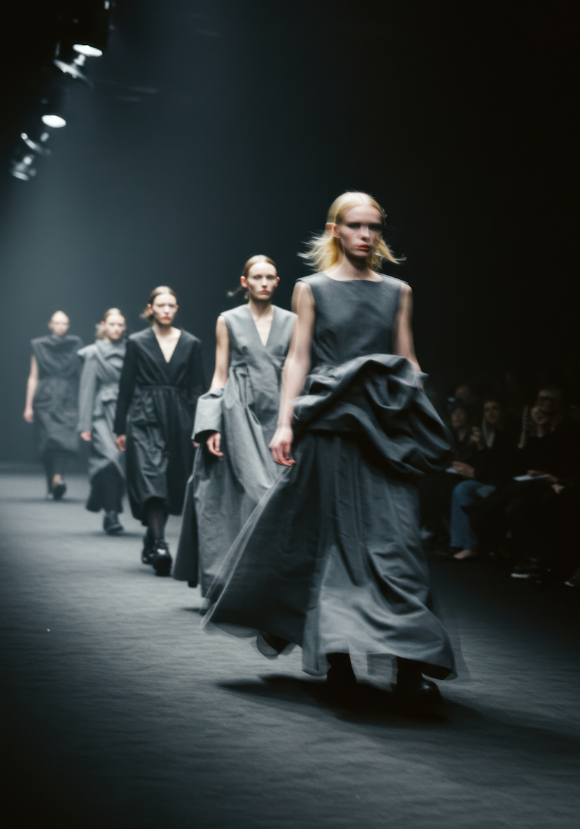
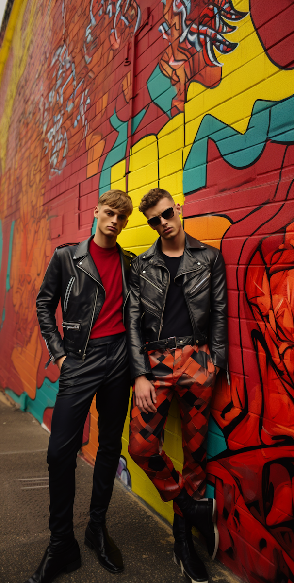
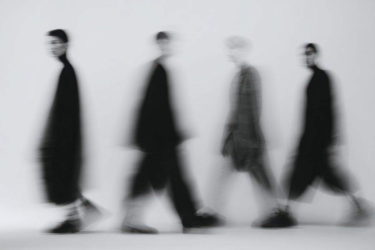
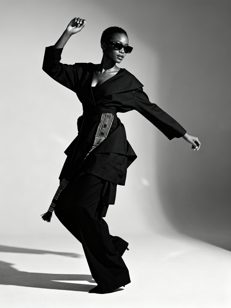
Parallax Gallery
Four-column image grid where each column scrolls at a different speed using GSAP ScrollTrigger. Columns are offset vertically and move at multiplied rates, creating a depth-layered parallax as you scroll.
View Full Demo →Preview


Source
import ParallaxGallery from './index.jsx';
import styles from './demo.module.css';

// 9 model images — cols 4 reuses model0–model2
const IMAGES = [
  { src: '/demo-assets/models/model0.png', alt: '' },
  { src: '/demo-assets/models/model1.png', alt: '' },
  { src: '/demo-assets/models/model2.png', alt: '' },
  { src: '/demo-assets/models/model3.png', alt: '' },
  { src: '/demo-assets/models/model4.png', alt: '' },
  { src: '/demo-assets/models/model5.png', alt: '' },
  { src: '/demo-assets/models/model6.png', alt: '' },
  { src: '/demo-assets/models/model7.png', alt: '' },
  { src: '/demo-assets/models/model8.png', alt: '' },
  { src: '/demo-assets/models/model0.png', alt: '' },
  { src: '/demo-assets/models/model1.png', alt: '' },
  { src: '/demo-assets/models/model2.png', alt: '' },
];

export default function ParallaxGalleryDemo() {
  return (
    <div className={styles.demo}>
      <section className={styles.intro}>
        <p className={styles.label}>Parallax Gallery</p>
        <h1 className={styles.heading}>Scroll to explore</h1>
      </section>
      <ParallaxGallery images={IMAGES} />
    </div>
  );
}
'use client';

import { useEffect, useRef } from 'react';
import gsap from 'gsap';
import { ScrollTrigger } from 'gsap/ScrollTrigger';
import styles from './styles.module.css';

const MULTIPLIERS = [2, 3.3, 1.25, 3];

export default function ParallaxGallery({ images = [] }) {
  const galleryRef = useRef(null);
  const colRefs = useRef([]);

  useEffect(() => {
    gsap.registerPlugin(ScrollTrigger);
    const gallery = galleryRef.current;
    if (!gallery) return;

    const ctx = gsap.context(() => {
      colRefs.current.forEach((col, i) => {
        if (!col) return;
        gsap.fromTo(
          col,
          { y: 0 },
          {
            y: () => window.innerHeight * MULTIPLIERS[i],
            ease: 'none',
            scrollTrigger: {
              trigger: gallery,
              start: 'top bottom',
              end: 'bottom top',
              scrub: true,
              invalidateOnRefresh: true,
            },
          }
        );
      });
    }, gallery);

    return () => ctx.revert();
  }, []);

  const columns = [
    images.slice(0, 3),
    images.slice(3, 6),
    images.slice(6, 9),
    images.slice(9, 12),
  ];

  return (
    <>
      <div className={styles.spacer} />
      <div ref={galleryRef} className={styles.gallery}>
        <div className={styles.galleryWrapper}>
          {columns.map((colImages, colIndex) => (
            <div
              key={colIndex}
              ref={el => { colRefs.current[colIndex] = el; }}
              className={styles.column}
            >
              {colImages.map((image, i) => (
                <div key={i} className={styles.imageContainer}>
                  <img
                    src={image.src}
                    alt={image.alt}
                    className={styles.image}
                  />
                </div>
              ))}
            </div>
          ))}
        </div>
      </div>
      <div className={styles.spacer} />
    </>
  );
}
.demo {
  background: var(--color-bg);
}

.intro {
  display: flex;
  flex-direction: column;
  align-items: center;
  justify-content: center;
  min-height: 100vh;
  text-align: center;
  padding: var(--space-16);
}

.label {
  font-size: var(--text-xs);
  font-weight: var(--weight-semibold);
  letter-spacing: 0.1em;
  text-transform: uppercase;
  color: var(--color-text-tertiary);
  margin-bottom: var(--space-6);
}

.heading {
  font-size: clamp(2.5rem, 6vw, 5rem);
  font-weight: var(--weight-bold);
  letter-spacing: -0.03em;
  line-height: var(--leading-tight);
  color: var(--color-text);
}
.spacer {
  height: 100vh;
}

.gallery {
  --color-black: #0a0a0a;
  height: 175vh;
  overflow: hidden;
  background-color: var(--color-black);
}

.galleryWrapper {
  position: relative;
  top: -12.5vh;
  height: 200vh;
  display: flex;
  gap: 2vw;
  padding: 2vw;
}

.column {
  position: relative;
  height: 100%;
  width: 25%;
  min-width: 250px;
  display: flex;
  flex-direction: column;
  gap: 2vw;
}

.column:nth-child(1) {
  top: -30%;
}

.column:nth-child(2) {
  top: -70%;
}

.column:nth-child(3) {
  top: -30%;
}

.column:nth-child(4) {
  top: -60%;
}

.imageContainer {
  position: relative;
  height: 33%;
  width: 100%;
  border-radius: 1vw;
  overflow: hidden;
  flex-shrink: 0;
}

.image {
  position: absolute;
  inset: 0;
  width: 100%;
  height: 100%;
  object-fit: cover;
}
Dependencies
gsap
More in Animations

Apr 27, 2026
ANIMATIONSCursor Hover Label
A custom cursor label that follows the mouse and fades in when hovering trigger elements. Uses GSAP quickTo for smooth tracking. Trigger elements use data-cursor-label attributes to set label text. Inspired by portfolio/agency sites like Studio PIC.

Apr 27, 2026
ANIMATIONSSection Transition 01
GSAP ScrollTrigger-based section transition system. Sibling sections opt into parallax, pin, or reveal modes via data attributes. Supports y offset, overlay opacity, and overlay color per section. Mobile strategy simplifies motion on smaller screens.

Apr 27, 2026
ANIMATIONSText Reveal 01
GSAP SplitText-based text reveal system. Text elements opt in with data-reveal-01 and split into lines, words, or characters. Supports load-time reveals, scroll-triggered reveals, scrubbed scroll reveals, and manual split-only mode for custom timelines. Per-element overrides for duration, stagger, delay, ease, and replay behavior.