Centered Intro
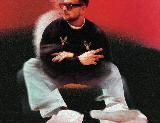
A centered editorial section with a large heading, bold body paragraph, and a full-width image. On desktop the text sits above the image; on mobile the image slots between heading and body.
View Full Demo →Preview
DOSNOVENTA®
DOSNOVENTA WAS FOUNDED IN BARCELONA IN 2012 BY A GROUP OF LIKE-MINDED INDIVIDUALS. WE CREATE HIGH-QUALITY, EFFICIENT AND LONG-LASTING BICYCLES WITH A STRONG IDENTITY FOR CONTEMPORARY RIDING. CELEBRATING STREET CULTURE WITH A DIFFERENT PERSPECTIVE, WE DESIGN HIGH-END PERFORMANCE URBAN BIKES, ALWAYS SEEKING PERFECTION. MADE BY CYCLISTS, FOR CYCLISTS. DOSNOVENTA IS MUCH MORE THAN A BRAND, IT'S ABOUT ATTITUDE AND STYLE. DOSNOVENTA TOOK PART IN THE REVOLUTION OF THE FIXED GEAR WORLD AND HAS BECOME A GLOBAL BRAND THAT INSPIRES A NEW GENERATION OF RIDERS FROM ALL OVER THE PLANET.
Source
import CenteredIntro from "./index.jsx";
import { centeredIntro } from "../demo-data.js";

export default function CenteredIntroDemo() {
  return <CenteredIntro {...centeredIntro} />;
}
import styles from "./styles.module.css";

export default function CenteredIntro({ heading, body, image }) {
  return (
    <section className={styles.section}>
      {heading && <h2 className={styles.heading}>{heading}</h2>}
      {body && <p className={styles.body}>{body}</p>}
      {image && (
        <div className={styles.imageWrapper}>
          <img
            src={image.src}
            alt={image.alt ?? ""}
            style={{ position: "absolute", inset: 0, width: "100%", height: "100%", objectFit: "cover", objectPosition: "center" }}
          />
        </div>
      )}
    </section>
  );
}
.section {
  --color-black: #111;

  display: flex;
  flex-direction: column;
  align-items: center;
  padding: 4rem 4vw;
  gap: 2rem;
  background: #fff;
  color: var(--color-black);
}

.heading {
  order: 1;
  font-size: clamp(2rem, 5vw, 5.5rem);
  font-weight: 900;
  text-transform: uppercase;
  text-align: center;
  letter-spacing: -0.01em;
  line-height: 1.1;
  margin: 0;
}

.body {
  order: 2;
  font-size: clamp(0.8rem, 1.3vw, 1.15rem);
  font-weight: 700;
  text-transform: uppercase;
  text-align: center;
  line-height: 1.55;
  max-width: 62em;
  margin: 0;
}

.imageWrapper {
  order: 3;
  width: 100%;
  aspect-ratio: 16 / 9;
  position: relative;
  overflow: hidden;
}

/* Mobile: image slots between heading and body */
@media (max-width: 768px) {
  .imageWrapper { order: 2; }
  .body { order: 3; }
}
More in Sections

May 11, 2026
SECTIONSDual Push Cards
Two-up CTA card section with scroll-driven parallax on each card's background image. Cards scale down and drift vertically as you scroll past. Glassmorphic blur buttons at bottom-left. Stacks on mobile, side-by-side grid on desktop.

May 4, 2026
SECTIONSPortfolio Grid
A responsive portfolio showcase section with a header tagline, blinking cursor counters, a 2-up/4-col project card grid with hover-zoom images and data-label metadata, plus a full-width CTA button. Scroll-triggered fade and move-up animations via GSAP.
May 1, 2026
SECTIONSLogo Wall Cycle
A responsive logo grid that cycles through brand logos with smooth GSAP-powered swap animations. Shows 8 logos on desktop and 6 on tablet, shuffling hidden logos into view on a timed loop. Pauses when out of viewport or tab is hidden.