Who We Are
A full about section with SplitText heading and subheading reveals, two-column content rows for approach and collaboration, a 3-column founders portrait grid with hover scale, and a pill CTA button.
View Full Demo →Preview
Who We Are
We are a creative development studio shaping digital work where clarity meets intensity — merging design, engineering, and motion into experiences that feel alive.
Approach
We approach every project as a system — where clarity, rhythm, and motion define how ideas take shape. We design not just for screens, but for the way people feel and interact. Our process blends conceptual thinking with technical precision, turning stories into digital experiences that live across time and media.
Founders
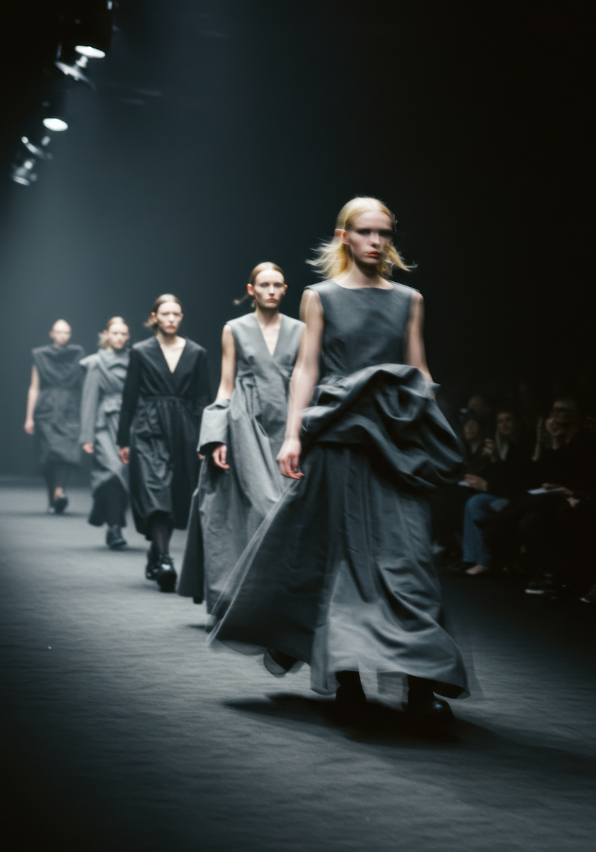
Valérian Kinyock
Creative Developer
We believe in precision and empathy in equal measure.
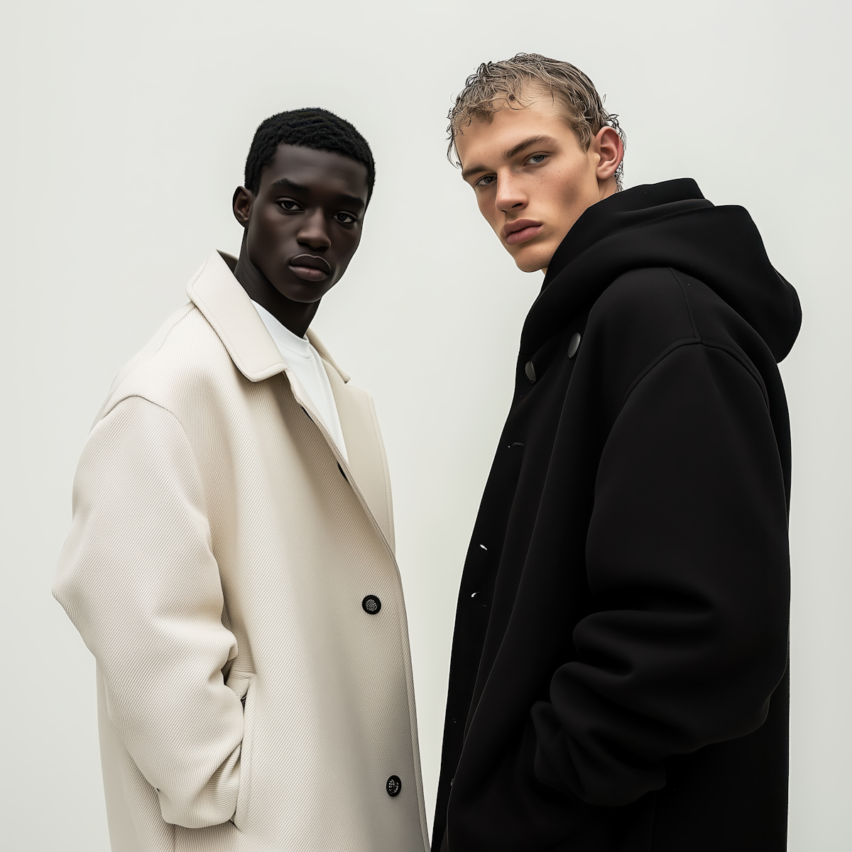
Sophie Nguyen
Producer & Partner
Every detail matters — rhythm, type, proportion.
Nina Lens
Editorial Designer
We move ideas forward through design and motion.
Collaboration
We work with founders, cultural institutions and creative brands to design digital systems with clarity and emotion. Whether you're building a new brand, rethinking your identity or crafting your digital presence — we help translate vision into form, movement and code.
Start a ProjectSource
import WhoWeAre from "./index.jsx";
import { whoWeAre } from "../demo-data.js";

export default function WhoWeAreDemo() {
  return <WhoWeAre {...whoWeAre} />;
}
"use client";

import { useEffect, useRef } from "react";
import { gsap } from "gsap";
import { ScrollTrigger } from "gsap/ScrollTrigger";
import { SplitText } from "gsap/SplitText";
import styles from "./styles.module.css";

gsap.registerPlugin(ScrollTrigger, SplitText);

function ContentRow({ label, children, labelRef, contentRef, border }) {
  return (
    <div className={`${styles.row} ${border ? styles.rowBorder : ""}`}>
      <div className={styles.rowLabel}>
        <div ref={labelRef}>
          <h4>{label}</h4>
        </div>
      </div>
      <div className={styles.rowContent} ref={contentRef}>
        {children}
      </div>
    </div>
  );
}

function FounderCard({ person }) {
  return (
    <div className={styles.card}>
      <div className={styles.cardImageWrap}>
        <img src={person.image} alt={person.name} className={styles.cardImage} />
      </div>
      <div className={styles.cardInfo}>
        <p className={styles.cardName}>{person.name}</p>
        <p className={styles.cardRole}>{person.role}</p>
        {person.quote && <p className={styles.cardQuote}>{person.quote}</p>}
      </div>
    </div>
  );
}

export default function WhoWeAre({
  heading = "Who We Are",
  subheading = "",
  approach = {},
  founders = {},
  collaboration = {},
}) {
  const sectionRef = useRef(null);
  const headingRef = useRef(null);
  const subheadingRef = useRef(null);

  const approachLabelRef = useRef(null);
  const approachContentRef = useRef(null);
  const foundersLabelRef = useRef(null);
  const foundersContentRef = useRef(null);
  const collabLabelRef = useRef(null);
  const collabContentRef = useRef(null);

  useEffect(() => {
    const ctx = gsap.context(() => {
      /* ---- Heading: char reveal ---- */
      if (headingRef.current) {
        SplitText.create(headingRef.current, {
          type: "chars",
          charsClass: styles.charChild,
          mask: "chars",
        });
        const chars = headingRef.current.querySelectorAll(`.${styles.charChild}`);
        gsap.from(chars, {
          yPercent: 100,
          opacity: 0,
          duration: 0.8,
          stagger: 0.03,
          ease: "power4.out",
          scrollTrigger: { trigger: headingRef.current, start: "top 80%", once: true },
        });
      }

      /* ---- Subheading: line reveal ---- */
      if (subheadingRef.current) {
        SplitText.create(subheadingRef.current, {
          type: "lines",
          linesClass: styles.lineChild,
          mask: "lines",
        });
        const lines = subheadingRef.current.querySelectorAll(`.${styles.lineChild}`);
        gsap.from(lines, {
          yPercent: 100,
          opacity: 0,
          duration: 1,
          stagger: 0.06,
          ease: "power4.out",
          scrollTrigger: { trigger: subheadingRef.current, start: "top 75%", once: true },
        });
      }

      /* ---- Content rows: fade in ---- */
      const animateRow = (labelEl, contentEl, fromX) => {
        if (labelEl) {
          gsap.from(labelEl, {
            x: fromX ? -100 : 0,
            y: fromX ? 0 : 30,
            opacity: 0,
            duration: 0.8,
            ease: "power3.out",
            scrollTrigger: { trigger: labelEl, start: "top 80%", once: true },
          });
        }
        if (contentEl) {
          gsap.from(contentEl, {
            y: 60,
            opacity: 0,
            duration: 0.9,
            ease: "power3.out",
            scrollTrigger: { trigger: contentEl, start: "top 85%", once: true },
          });
        }
      };

      animateRow(approachLabelRef.current, approachContentRef.current, false);
      animateRow(foundersLabelRef.current, foundersContentRef.current, false);
      animateRow(collabLabelRef.current, collabContentRef.current, true);
    }, sectionRef);

    return () => ctx.revert();
  }, []);

  return (
    <section ref={sectionRef} className={styles.section}>
      {/* Heading */}
      <h2 ref={headingRef} className={styles.heading}>{heading}</h2>

      <div className={styles.spacerSm} />

      {/* Subheading */}
      {subheading && (
        <p ref={subheadingRef} className={styles.subheading}>{subheading}</p>
      )}

      {/* Approach */}
      {approach.text && (
        <ContentRow
          label={approach.label || "Approach"}
          labelRef={approachLabelRef}
          contentRef={approachContentRef}
        >
          <p className={styles.bodyText}>{approach.text}</p>
        </ContentRow>
      )}

      {/* Founders */}
      {founders.people?.length > 0 && (
        <ContentRow
          label={founders.label || "Founders"}
          labelRef={foundersLabelRef}
          contentRef={foundersContentRef}
        >
          <div className={styles.foundersGrid}>
            {founders.people.map((person, i) => (
              <FounderCard key={i} person={person} />
            ))}
          </div>
        </ContentRow>
      )}

      {/* Collaboration */}
      {collaboration.text && (
        <ContentRow
          label={collaboration.label || "Collaboration"}
          labelRef={collabLabelRef}
          contentRef={collabContentRef}
          border
        >
          <div className={styles.collabContent}>
            <p className={styles.bodyText}>{collaboration.text}</p>
            {collaboration.ctaLabel && (
              <a
                href={collaboration.ctaHref || "#"}
                className={styles.ctaButton}
              >
                {collaboration.ctaLabel}
              </a>
            )}
          </div>
        </ContentRow>
      )}
    </section>
  );
}
.section {
  width: 100%;
  min-height: 100dvh;
  background: #fff;
  padding: 0 2rem;
}

/* ---- Heading ---- */
.heading {
  font-size: clamp(3rem, 10vw, 9rem);
  font-weight: 700;
  line-height: 1;
  letter-spacing: -0.03em;
  color: #000;
  text-transform: uppercase;
}

.charChild {
  position: relative;
  display: inline-block;
}

/* ---- Subheading ---- */
.subheading {
  font-size: clamp(1.25rem, 2.5vw, 2rem);
  font-weight: 400;
  line-height: 1.3;
  text-transform: uppercase;
  color: #000;
  max-width: 50ch;
}

.lineChild {
  position: relative;
  display: block;
  text-align: start;
}

.spacerSm {
  height: 3rem;
}

/* ---- Content rows ---- */
.row {
  display: flex;
  flex-direction: column;
  align-items: stretch;
  margin-top: 2rem;
}

.rowBorder {
  margin-top: 12rem;
  border-top: 1px solid rgba(0, 0, 0, 0.1);
  padding-top: 6rem;
}

.rowLabel {
  width: 100%;
  flex-shrink: 0;
  margin-bottom: 1rem;
}

.rowLabel h4 {
  font-size: 1rem;
  font-weight: 600;
  color: #000;
  text-transform: uppercase;
  letter-spacing: 0.03em;
}

.rowContent {
  flex: 1;
  min-width: 0;
}

/* ---- Body text ---- */
.bodyText {
  max-width: 70ch;
  font-size: clamp(14px, 1.2vw, 18px);
  line-height: 1.45;
  color: rgba(0, 0, 0, 0.8);
  white-space: pre-line;
}

/* ---- Founders grid ---- */
.foundersGrid {
  display: grid;
  grid-template-columns: 1fr;
  gap: 1.5rem;
  width: 100%;
}

.card {
  display: flex;
  flex-direction: column;
}

.cardImageWrap {
  position: relative;
  width: 100%;
  aspect-ratio: 4 / 5;
  overflow: hidden;
  border: 1px solid rgba(0, 0, 0, 0.1);
  border-radius: 0.125rem;
}

.cardImage {
  width: 100%;
  height: 100%;
  object-fit: cover;
  display: block;
  transition: transform 0.5s ease;
}

.card:hover .cardImage {
  transform: scale(1.03);
}

.cardInfo {
  margin-top: 1rem;
}

.cardName {
  font-size: 15px;
  font-weight: 600;
  line-height: 1.2;
  color: #000;
}

.cardRole {
  font-size: 12px;
  text-transform: uppercase;
  letter-spacing: 0.06em;
  color: rgba(0, 0, 0, 0.6);
}

.cardQuote {
  margin-top: 0.5rem;
  font-size: 14px;
  line-height: 1.375;
  color: rgba(0, 0, 0, 0.7);
}

/* ---- Collaboration ---- */
.collabContent {
  display: flex;
  flex-direction: column;
  gap: 1.5rem;
}

.ctaButton {
  display: inline-flex;
  width: fit-content;
  align-items: center;
  gap: 0.5rem;
  font-size: 1rem;
  letter-spacing: 0.07em;
  text-transform: uppercase;
  text-decoration: none;
  color: #fff;
  background: #000;
  border: 1px solid #000;
  border-radius: 9999px;
  padding: 1rem 1.75rem;
  cursor: pointer;
  transition: transform 0.3s ease, letter-spacing 0.3s ease, border-color 0.3s ease;
}

.ctaButton:hover {
  transform: scale(1.1);
  letter-spacing: -0.05em;
  border-color: rgba(0, 0, 0, 0.2);
}

/* ---- Desktop ---- */
@media (min-width: 768px) {
  .spacerSm {
    height: 0;
  }

  .row {
    flex-direction: row;
    margin-top: 8rem;
  }

  .rowBorder {
    margin-top: 12rem;
    align-items: center;
  }

  .rowLabel {
    width: 30%;
    flex-shrink: 0;
    margin-bottom: 0;
  }

  .foundersGrid {
    grid-template-columns: repeat(3, 1fr);
  }

  .ctaButton {
    font-size: 1.25rem;
  }
}

/* ---- Mobile ---- */
@media (max-width: 767px) {
  .section {
    padding: 0 1rem;
  }

  .rowBorder {
    margin-top: 6rem;
    padding-top: 3rem;
  }
}
Dependencies
gsap
More in Sections

May 11, 2026
SECTIONSDual Push Cards
Two-up CTA card section with scroll-driven parallax on each card's background image. Cards scale down and drift vertically as you scroll past. Glassmorphic blur buttons at bottom-left. Stacks on mobile, side-by-side grid on desktop.

May 4, 2026
SECTIONSPortfolio Grid
A responsive portfolio showcase section with a header tagline, blinking cursor counters, a 2-up/4-col project card grid with hover-zoom images and data-label metadata, plus a full-width CTA button. Scroll-triggered fade and move-up animations via GSAP.
May 1, 2026
SECTIONSLogo Wall Cycle
A responsive logo grid that cycles through brand logos with smooth GSAP-powered swap animations. Shows 8 logos on desktop and 6 on tablet, shuffling hidden logos into view on a timed loop. Pauses when out of viewport or tab is hidden.