Video Media Section
A full-width video section with lazy loading via IntersectionObserver. The video source is only fetched when the section scrolls into view, then autoplays muted and looped.
View Full Demo →Preview
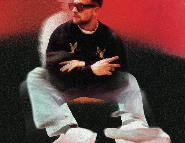
NĪNEpointNĪNE | Studio
NO-5®
Source
import VideoMediaSection from "./index.jsx";
import { videoMediaSection } from "../demo-data.js";

export default function VideoMediaSectionDemo() {
  return <VideoMediaSection {...videoMediaSection} />;
}
"use client";
import { useEffect, useRef, useState } from "react";
import styles from "./styles.module.css";

export default function VideoMediaSection({
  backgroundSrc,
  videoSrc,
  leftLabel = "",
  rightLabel = "",
}) {
  const videoRef = useRef(null);
  const sourceRef = useRef(null);
  const sectionRef = useRef(null);
  const loadedRef = useRef(false);
  const [isPlaying, setIsPlaying] = useState(false);

  useEffect(() => {
    const el = sectionRef.current;
    if (!el) return;

    const observer = new IntersectionObserver(
      ([entry]) => {
        if (entry.isIntersecting && !loadedRef.current) {
          loadedRef.current = true;
          const video = videoRef.current;
          const source = sourceRef.current;
          source.src = source.dataset.src;
          video.load();
          video.play().then(() => setIsPlaying(true)).catch(() => {});
          observer.disconnect();
        }
      },
      { threshold: 0.25 }
    );

    observer.observe(el);
    return () => observer.disconnect();
  }, []);

  return (
    <section className={styles.section} ref={sectionRef}>
      <img src={backgroundSrc} alt="" className={styles.background} />

      <span className={`${styles.cross} ${styles.tl}`} aria-hidden="true" />
      <span className={`${styles.cross} ${styles.tr}`} aria-hidden="true" />
      <span className={`${styles.cross} ${styles.bl}`} aria-hidden="true" />
      <span className={`${styles.cross} ${styles.br}`} aria-hidden="true" />

      {leftLabel && <p className={`${styles.label} ${styles.labelLeft}`}>{leftLabel}</p>}
      {rightLabel && <p className={`${styles.label} ${styles.labelRight}`}>{rightLabel}</p>}

      <div className={`${styles.preview} ${isPlaying ? styles.playing : ""}`}>
        <video ref={videoRef} loop muted playsInline preload="none">
          <source ref={sourceRef} data-src={videoSrc} type="video/mp4" />
        </video>
      </div>
    </section>
  );
}
.wrapper {
  background: #111;
}
.section {
  position: relative;
  width: 100%;
  aspect-ratio: 16 / 7;
  overflow: hidden;
  background: #888;
}

/* ---- Background image ---- */
.background {
  position: absolute;
  inset: 0;
  width: 100%;
  height: 100%;
  object-fit: cover;
  object-position: center;
}

/* ---- Corner crosshairs ---- */
.cross {
  position: absolute;
  width: 18px;
  height: 18px;
  z-index: 2;
}
.cross::before,
.cross::after {
  content: "";
  position: absolute;
  background: rgba(255, 255, 255, 0.65);
}
.cross::before { width: 1px; height: 100%; left: 50%; transform: translateX(-50%); }
.cross::after  { height: 1px; width: 100%; top: 50%;  transform: translateY(-50%); }

.tl { top: 2rem; left: 2rem; }
.tr { top: 2rem; right: 2rem; }
.bl { bottom: 2rem; left: 2rem; }
.br { bottom: 2rem; right: 2rem; }

/* ---- Side labels ---- */
.label {
  position: absolute;
  top: 50%;
  transform: translateY(-50%);
  color: rgba(255, 255, 255, 0.85);
  font-size: clamp(0.55rem, 0.9vw, 0.78rem);
  font-weight: 600;
  letter-spacing: 0.06em;
  text-transform: uppercase;
  white-space: nowrap;
  margin: 0;
  z-index: 2;
}
.labelLeft  { left: 3.5rem; }
.labelRight { right: 3.5rem; }

/* ---- Small video preview overlay ---- */
.preview {
  position: absolute;
  bottom: 16%;
  left: 29%;
  width: clamp(160px, 22%, 320px);
  aspect-ratio: 4 / 3;
  border: 2px solid rgba(255, 255, 255, 0.75);
  overflow: hidden;
  background: #000;
  z-index: 2;
  opacity: 0;
  transition: opacity 0.4s ease;
}
.preview.playing {
  opacity: 1;
}

.preview video {
  width: 100%;
  height: 100%;
  object-fit: cover;
  display: block;
}

/* ---- Mobile ---- */
@media (max-width: 768px) {
  .section {
    aspect-ratio: 3 / 4;
  }

  .preview {
    left: 20%;
    bottom: 20%;
    width: clamp(120px, 38%, 200px);
  }

  .labelLeft  { left: 2rem; }
  .labelRight { right: 2rem; }
}
More in Sections

May 11, 2026
SECTIONSDual Push Cards
Two-up CTA card section with scroll-driven parallax on each card's background image. Cards scale down and drift vertically as you scroll past. Glassmorphic blur buttons at bottom-left. Stacks on mobile, side-by-side grid on desktop.

May 4, 2026
SECTIONSPortfolio Grid
A responsive portfolio showcase section with a header tagline, blinking cursor counters, a 2-up/4-col project card grid with hover-zoom images and data-label metadata, plus a full-width CTA button. Scroll-triggered fade and move-up animations via GSAP.
May 1, 2026
SECTIONSLogo Wall Cycle
A responsive logo grid that cycles through brand logos with smooth GSAP-powered swap animations. Shows 8 logos on desktop and 6 on tablet, shuffling hidden logos into view on a timed loop. Pauses when out of viewport or tab is hidden.