Gallery Image Reveal
A vertical project gallery where each row shows a split title with an image that expands on hover using GSAP. Clean, minimal layout for featured work sections.
View Full Demo →Preview
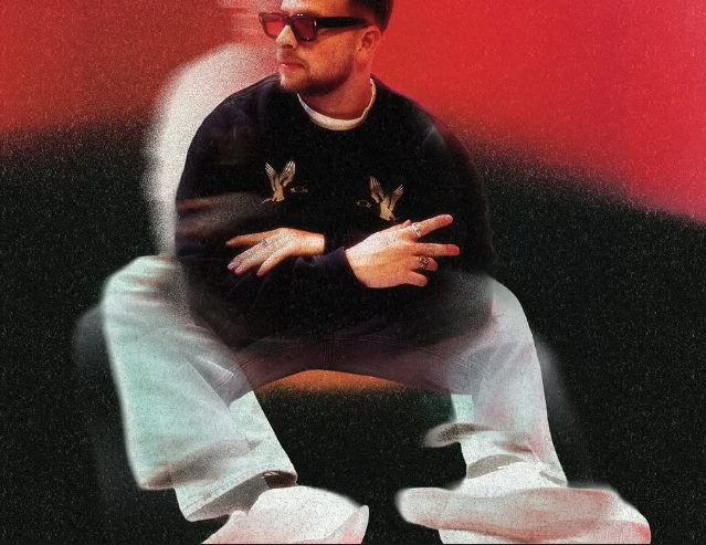
Kick &

Bass
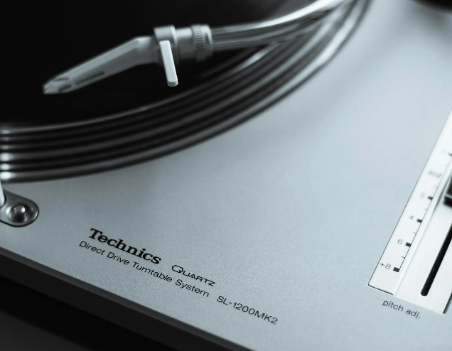
West
End
Delivrd
Studio
Social
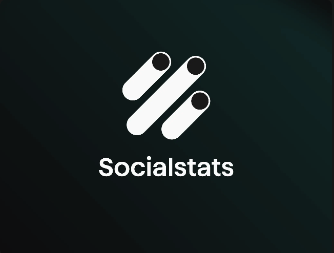
Stats
Kevin

Davis
Source
import GalleryImageReveal from "./index.jsx";
import { galleryImageReveal } from "../demo-data.js";
import styles from "./demo.module.css";

export default function GalleryImageRevealDemo() {
  return (
    <div className={styles.page}>
      <GalleryImageReveal projects={galleryImageReveal.projects} />
    </div>
  );
}
"use client";

import { useRef } from "react";
import gsap from "gsap";
import styles from "./styles.module.css";

function ProjectRow({ title1, title2, src }) {
  const imgRef = useRef(null);

  const handleEnter = () => {
    gsap.to(imgRef.current, {
      width: "auto",
      duration: 0.4,
      ease: "power3.out",
    });
  };

  const handleLeave = () => {
    gsap.to(imgRef.current, {
      width: 0,
      duration: 0.4,
      ease: "power3.out",
    });
  };

  return (
    <div
      className={styles.project}
      onMouseEnter={handleEnter}
      onMouseLeave={handleLeave}
    >
      <p>{title1}</p>
      <div ref={imgRef} className={styles.imgContainer}>
        <img src={src} alt={`${title1} ${title2}`} />
      </div>
      <p>{title2}</p>
    </div>
  );
}

export default function GalleryImageReveal({ projects = [] }) {
  return (
    <section className={styles.gallery}>
      {projects.map((project, i) => (
        <ProjectRow key={i} {...project} />
      ))}
    </section>
  );
}
.page {
  background: #fff;
  color: #111;
  min-height: 100vh;
  display: flex;
  align-items: center;
  justify-content: center;
}
.gallery {
  width: 70%;
  margin: 0 auto;
}

.project {
  border-top: 2px solid #111;
  padding-top: 0.8vw;
  padding-bottom: 0.8vw;
  cursor: pointer;
  width: 100%;
  display: flex;
  justify-content: center;
  align-items: center;
}

.project:last-of-type {
  border-bottom: 2px solid #111;
}

.project p {
  font-size: 5vw;
  margin: 0;
  text-transform: uppercase;
  font-weight: 500;
  white-space: nowrap;
}

.project p:nth-of-type(1) {
  margin-right: 0.75vw;
}

.project p:nth-of-type(2) {
  margin-left: 0.75vw;
}

.imgContainer {
  overflow: hidden;
  display: flex;
  justify-content: center;
  width: 0;
}

.imgContainer img {
  width: 10vw;
  min-width: 10vw;
  object-fit: cover;
}

@media (max-width: 768px) {
  .gallery {
    width: 90%;
  }

  .project p {
    font-size: 7vw;
  }

  .imgContainer img {
    width: 15vw;
    min-width: 15vw;
  }
}
Dependencies
gsap
More in Sections

May 11, 2026
SECTIONSDual Push Cards
Two-up CTA card section with scroll-driven parallax on each card's background image. Cards scale down and drift vertically as you scroll past. Glassmorphic blur buttons at bottom-left. Stacks on mobile, side-by-side grid on desktop.

May 4, 2026
SECTIONSPortfolio Grid
A responsive portfolio showcase section with a header tagline, blinking cursor counters, a 2-up/4-col project card grid with hover-zoom images and data-label metadata, plus a full-width CTA button. Scroll-triggered fade and move-up animations via GSAP.
May 1, 2026
SECTIONSLogo Wall Cycle
A responsive logo grid that cycles through brand logos with smooth GSAP-powered swap animations. Shows 8 logos on desktop and 6 on tablet, shuffling hidden logos into view on a timed loop. Pauses when out of viewport or tab is hidden.